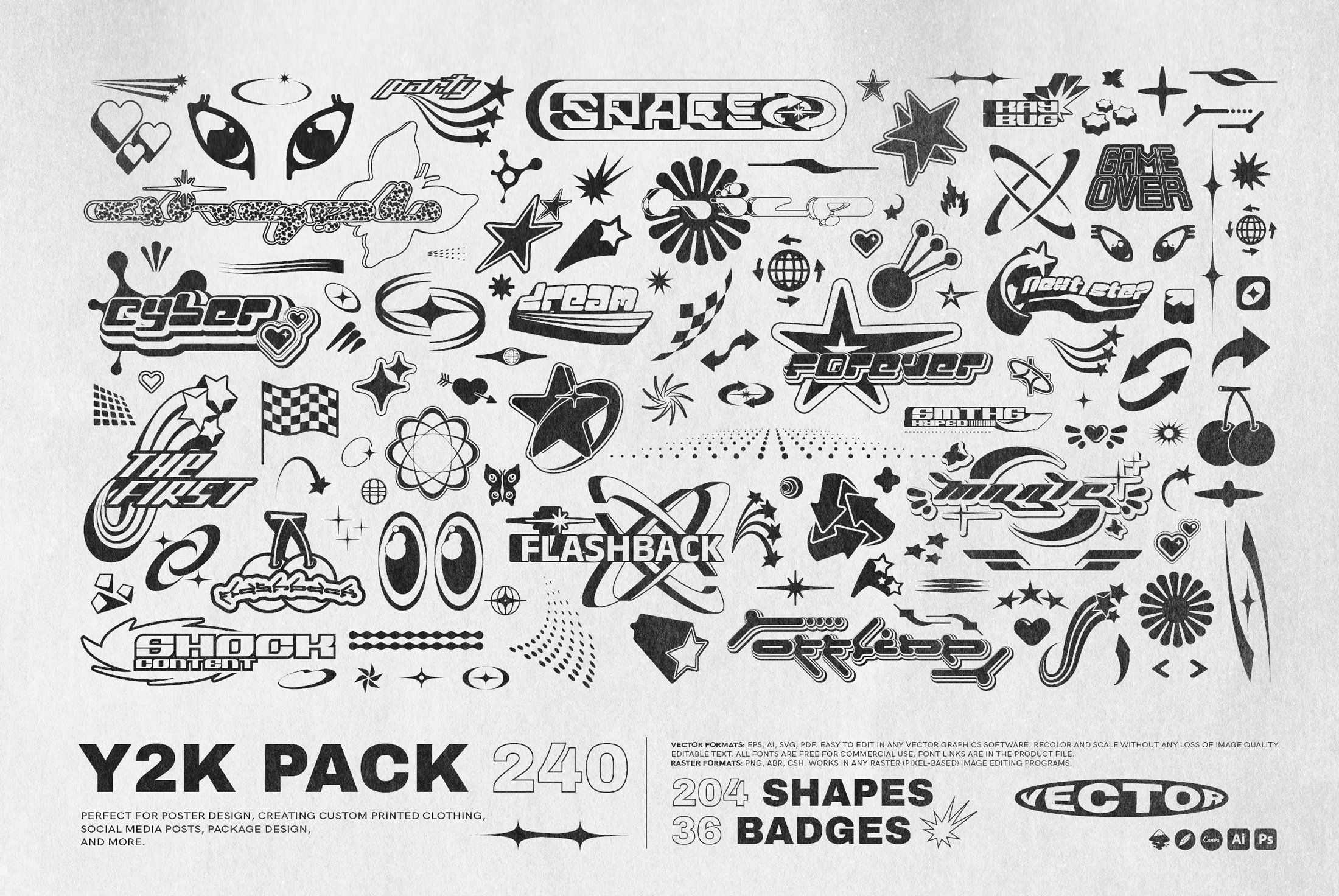
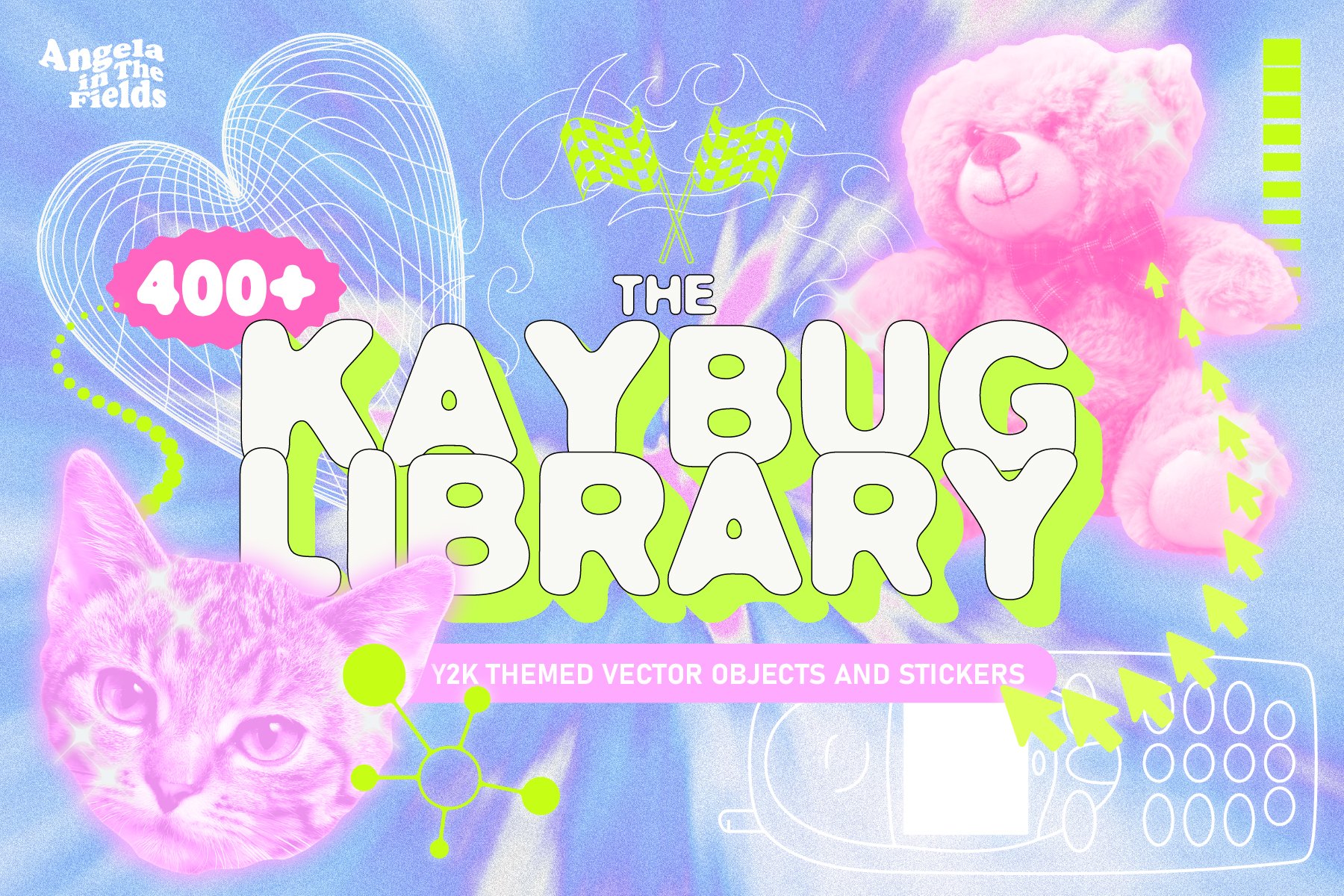
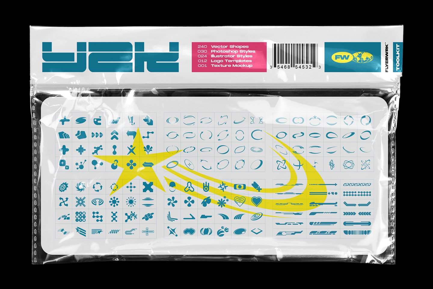
Y2K: 2000s Graphic Design Trend
Posted by Graphicdome on 26th Feb 2023
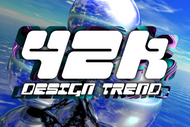
Y2K (Year 2000) graphic design refers to the graphic design style, visual aesthetics, and typographical trends prevalent during the late 1990s and early 2000s, which were characterized by the use of futuristic, technology-inspired elements such as glossy surfaces, chrome effects, neon colors, and abstract shapes. The Y2K design style was heavily influenced by advancements in technology, the Internet, and popular culture, and it was widely used in advertising, product packaging, fashion, and pop music.
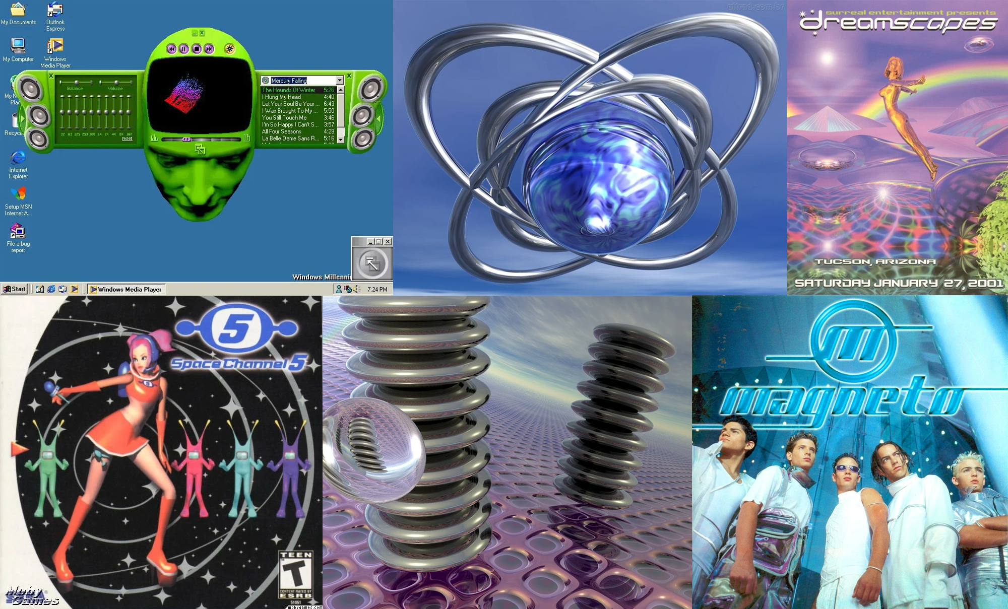 Credits: Aesthetics Fandom
Nostalgia in graphic design
Nostalgia is often used as a tool in graphic design to evoke emotions and memories from the past. This can be achieved through the use of recognizable visual elements, typography, and color palettes that are associated with a particular time period.
In graphic design, nostalgia can serve several purposes. For example, it can be used to create a sense of warmth and comfort, to evoke feelings of familiarity, to evoke feelings of longing or yearning for a bygone era, or to create a connection between the present and the past. Nostalgia can also be used as a way to evoke feelings of nostalgia for a particular brand or product, which can help to build emotional connections with consumers and increase brand recognition and loyalty.
Nostalgia can also play a role in shaping cultural identity and values, as it allows individuals to reflect on and celebrate aspects of their personal and collective history. The use of nostalgia in graphic design can be an effective way to communicate emotions, build emotional connections with audiences, and create visual designs that are memorable, meaningful, and impactful.
Y2K is an example of how nostalgia can be used as a tool in graphic design. Y2K design was a popular style in the late 1990s and early 2000s, and it reflects the pop culture influences and technological advancements of the era. The use of neon colors, chrome effects, and abstract shapes in Y2K design evoke feelings of nostalgia and memories of the past, and these elements can now be used to create a retro-inspired or nostalgic look in contemporary graphic design.
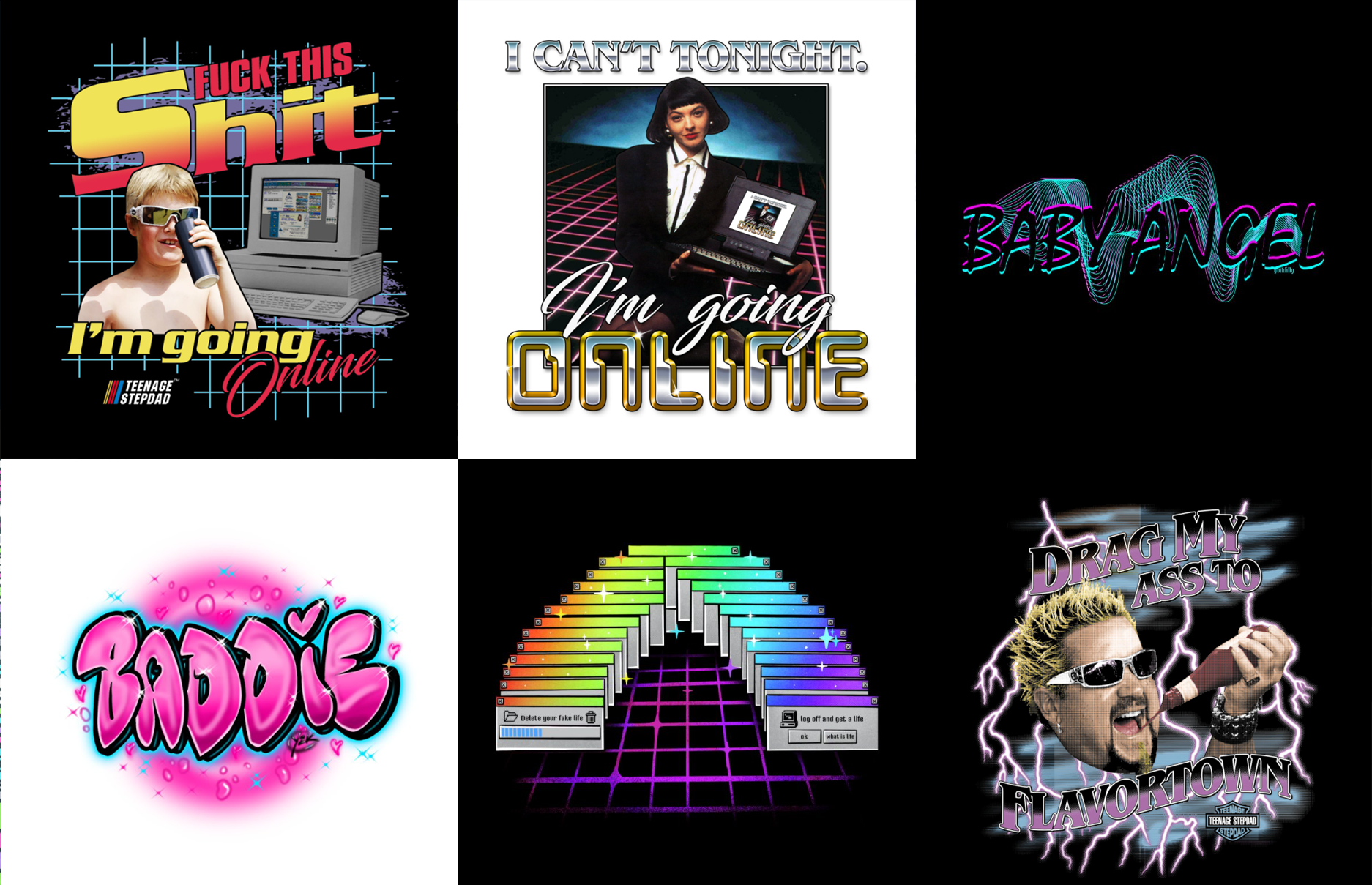 Credits: Threadless
Y2k design features
The most important features of Y2K graphic design include:
- Futuristic elements
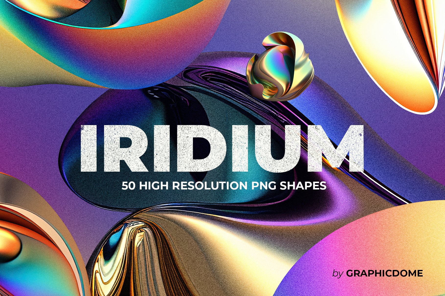
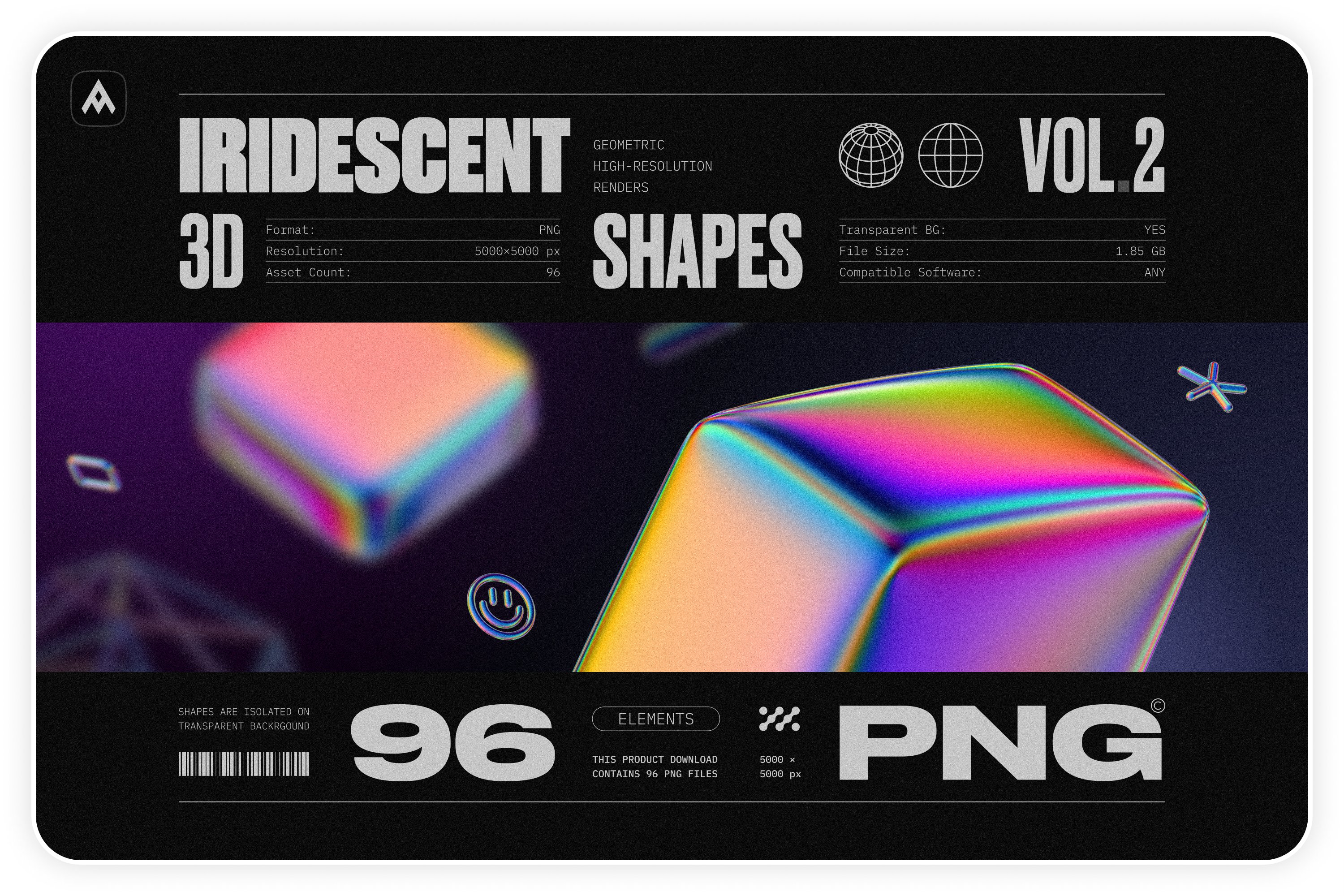
Y2K design was heavily influenced by advancements in technology and the Internet, and as a result, it often featured futuristic and technology-inspired elements such as chrome effects, neon colors, and abstract shapes.
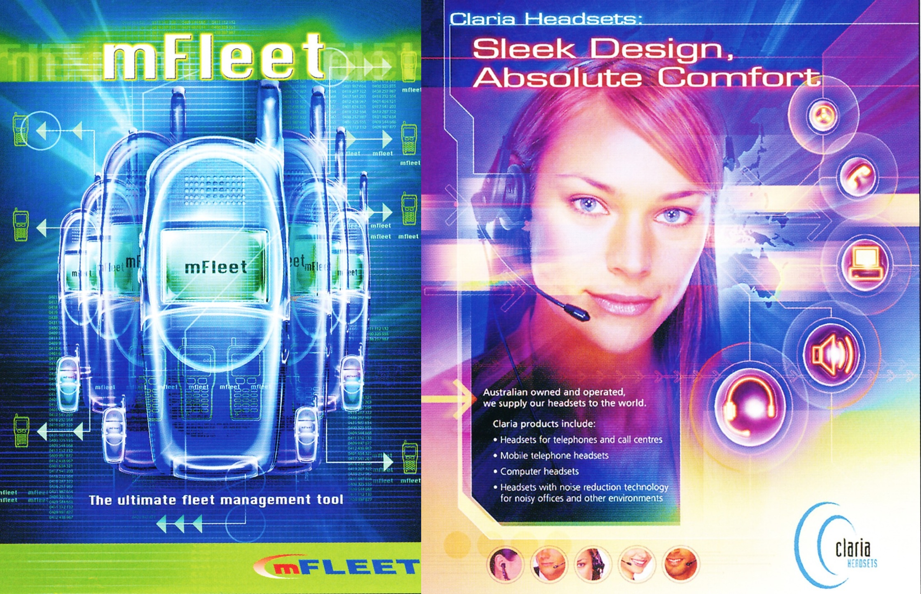 Credits: Tumblr
- Glossy surfaces
Y2K design was characterized by its use of highly reflective, glossy surfaces that added a modern and high-tech feel to designs.
- Neon colors
Bright, neon colors were a staple of Y2K design and were often used in combination with chrome and other futuristic elements to create a high-energy, tech-inspired look.
- Abstract shapes
Y2K design often featured abstract shapes and geometric patterns that reflected the technological advancements of the time and the influence of pop culture.
 Credits: Itsnicethat
- Typography
Y2K design was characterized by its use of bold, futuristic-looking fonts that reflected the technological and pop culture influences of the era.
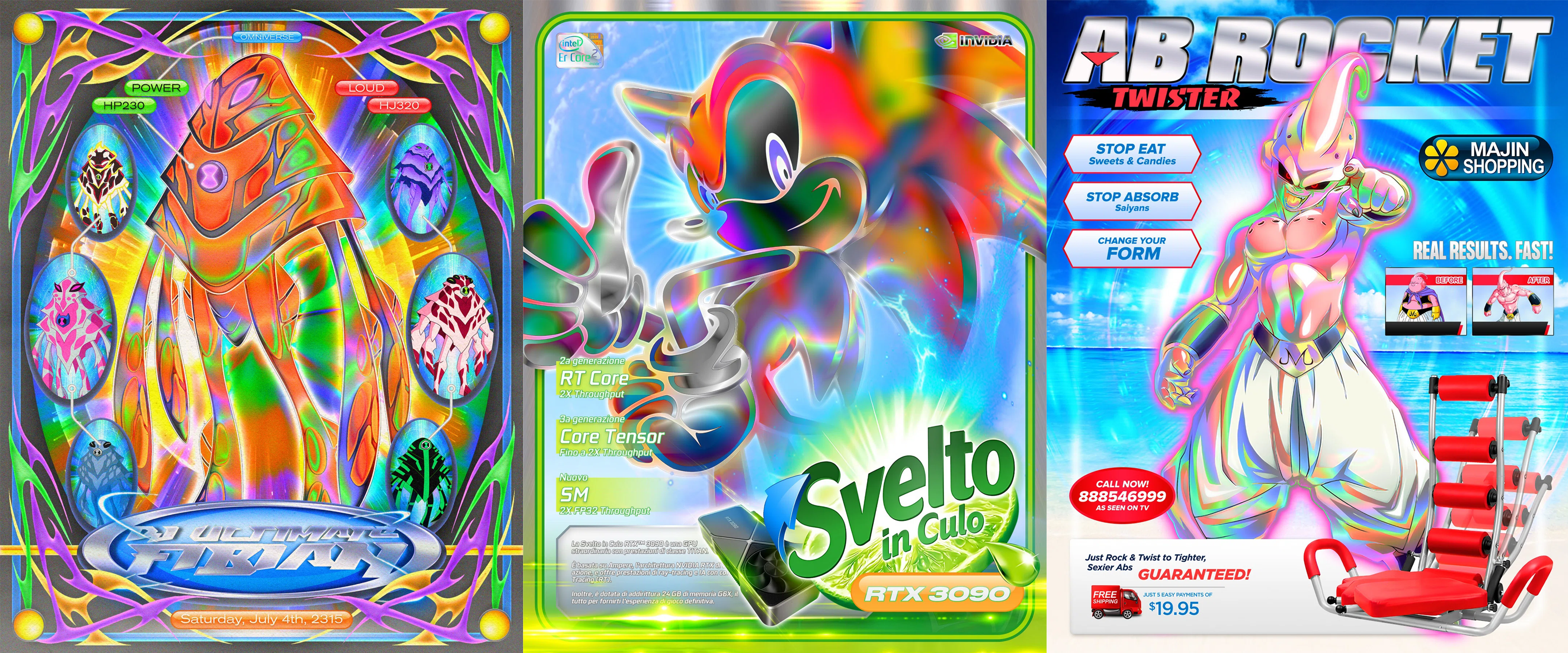 Credits: Itsnicethat
- Iconography
Y2K design often featured recognizable symbols and images associated with technology, such as circuit boards, modems, and satellites, as well as images from popular culture, such as aliens and futuristic spaceships.
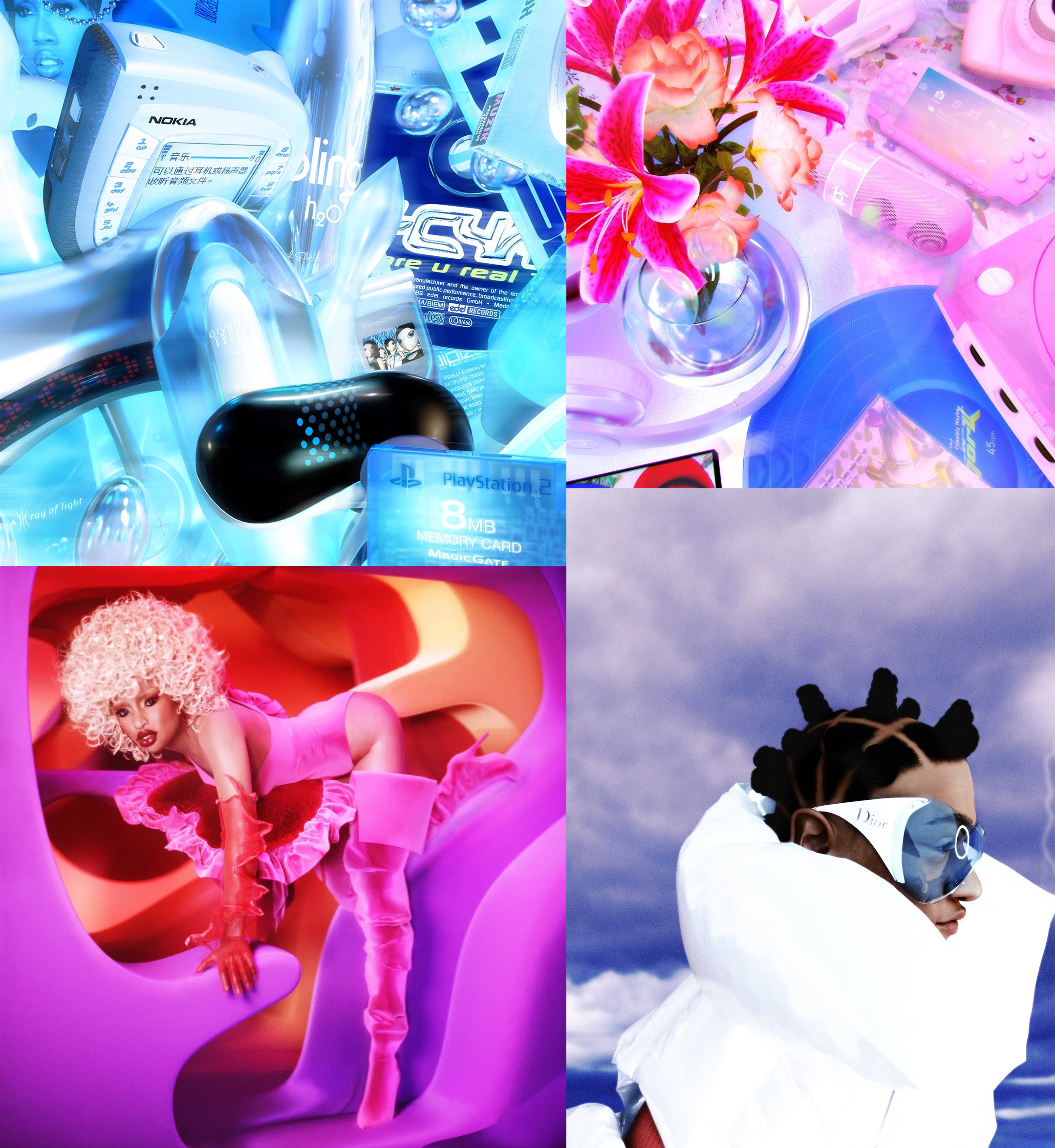 Credits: Twitter
- Y2K design color palette
The colors used in Y2K graphic design were bright, bold, and highly saturated.
Neon Colors: Colors such as pink, green, blue, and yellow were often used in neon variations to create a high-energy and futuristic look.
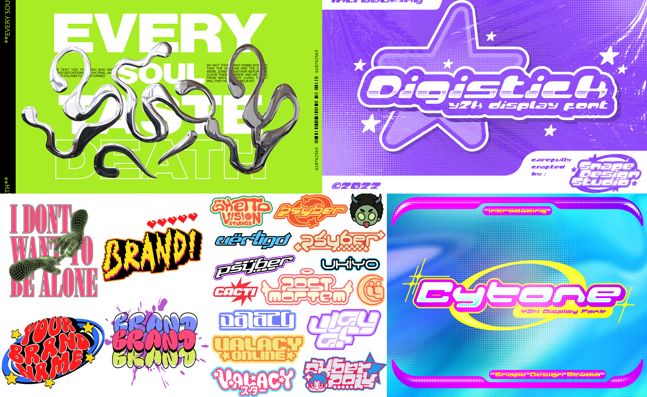 Credits: Behance
Bubblegum Pink: In Y2K design, bubblegum pink was often used in combination with shiny and reflective surfaces such as chrome to create a futuristic and technology-inspired look. The color was also used in combination with other neon colors and abstract shapes to create an overall high-energy and visually impactful aesthetic
Chrome: A metallic silver color was often used in Y2K design to give a high-tech and modern feel to designs.
Black: Black was used as a contrast color to enhance the brightness and saturation of the other colors used in Y2K design.
White: White was often used as a neutral background color to provide contrast and clarity in designs.
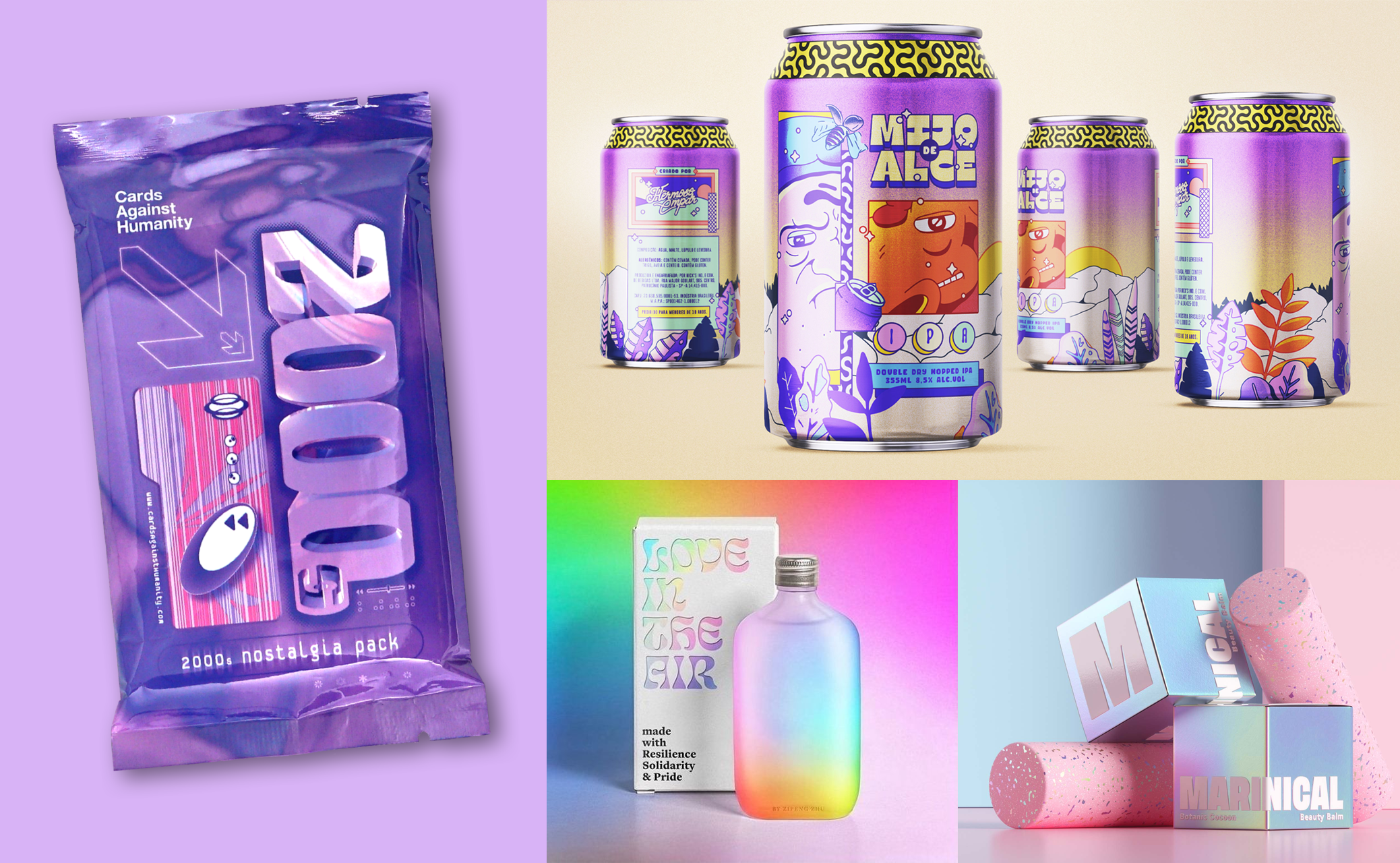 Credits: Thedieline
Overall, Y2K graphic design was known for its use of bright and highly saturated colors that reflected the technological advancements and pop culture influences of the era. The colors used in Y2K design were intended to create a high-energy, futuristic, and visually impactful look.
Suggested products


