The 90s Design Trend
Posted by Graphicdome on 9th Mar 2021
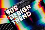
The 90s design trend started to make a comeback in late 2020s and it has become more and more visible online and offline, in fashion, video, or prints. The 1990s was a decade defined by multiple styles, cultures, and genres. Classic design rules were thrown out the window and the graphics became more experimental, thus resulting in multiple movements and styles that often influenced each other but also contradicted each other.
The 4 main graphic design styles were pop culture, grunge, anti-design, and rave. Pop culture was very influential and it was the main source of inspiration for fashion statements and graphics. And while there were different trends throughout the 90s, there were some key aesthetics that could be used to define the decade’s identity.

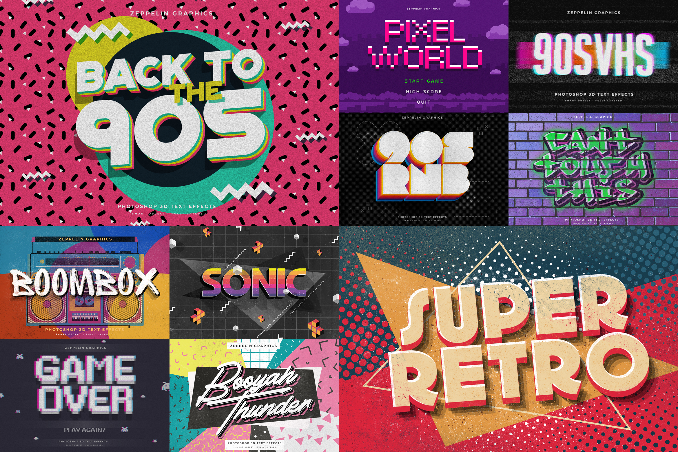
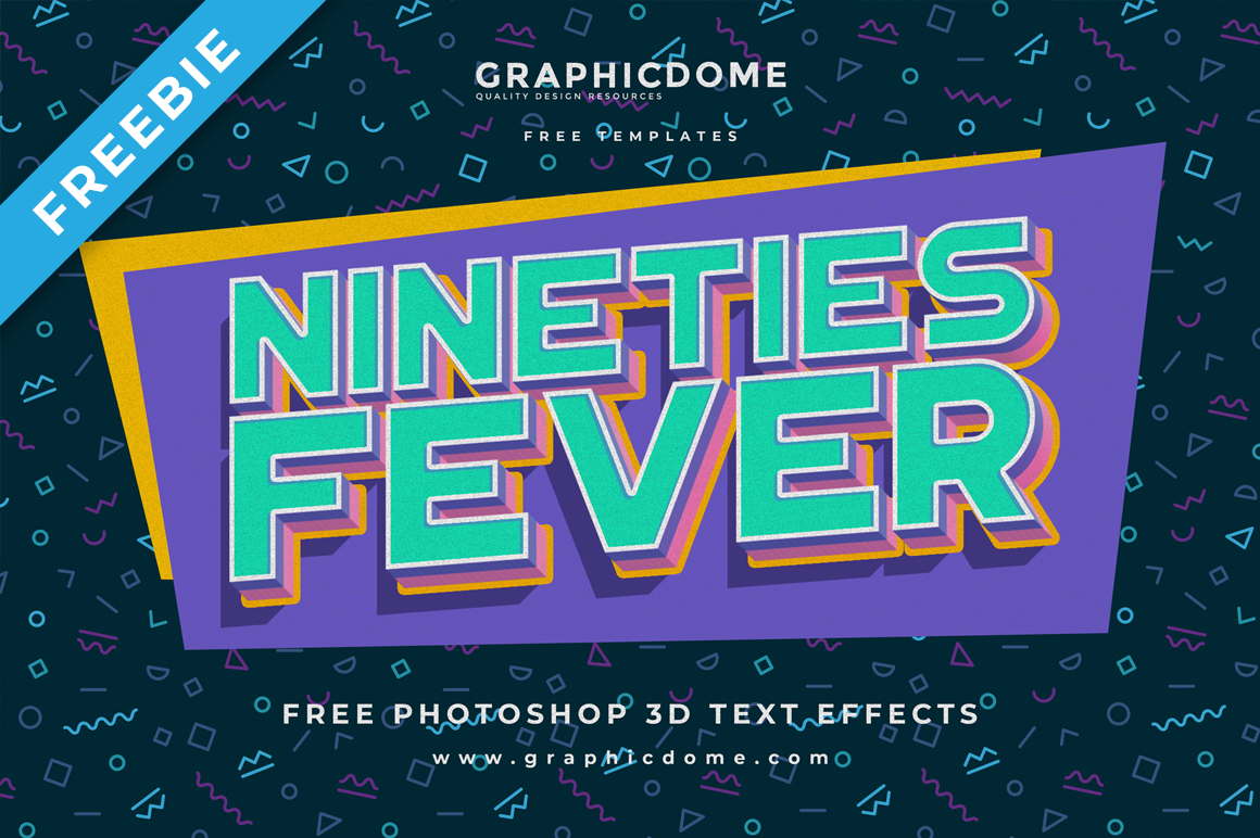
Fun patterns and vibrant colors were very popular and nowadays the Memphis patterns are the most representative graphics for the 90s on the internet. If you do a simple search of the 90s design trend, you will see a lot of colorful patterns with an emphasis on geometrical and abstract shapes.
The 90s impressive collection of rave posters and flyers used for music shows featured a distinct style of neon with heavy use of gradients. The 80s neon trend is very influential and visible in the rave style. Punk is another music genre tied to a very specific visual appearance in the 90s, and heavy use of collage and grunge elements and fonts are very characteristic.
Another aspect that was defying the established “rules” of design was the overuse of fonts such as Comic Sans that was created in 1994. It quickly becomes very popular and was used for a multitude of projects. Many other hand-drawn fonts were used in a wide variety of designs.
We have created a mood board below of multiple images taken from around the web that we think could give anyone an idea of how the 90s looked graphic-wise. And if you scroll down the page even more you will see images that represent the 4 distinct styles of the 90s mentioned above as well as various designs used in prints such as posters and album cover.
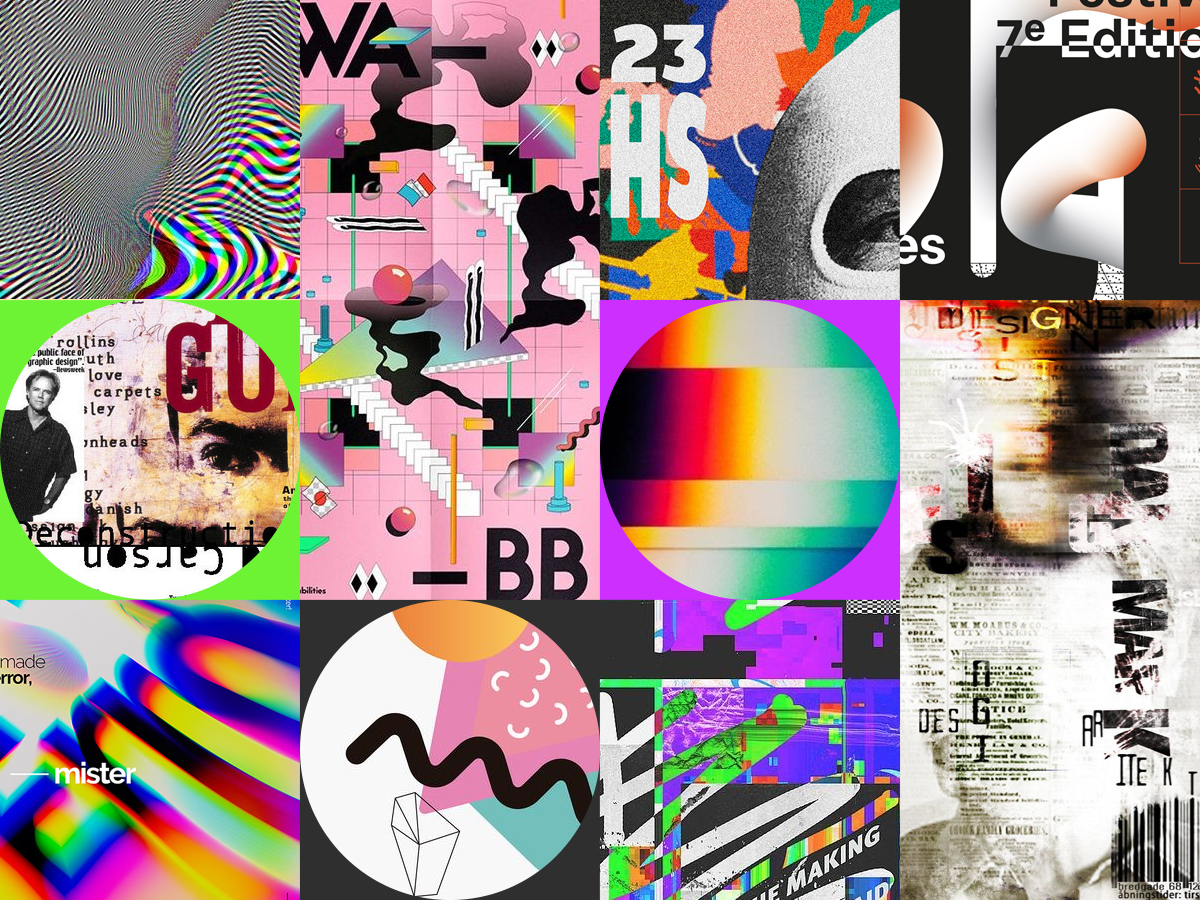 Credits: Lucrecia Rey Caro, abdz, Santiago Moscardi, Ionut Balan, Cecile Roger
Pop Culture
Pop culture refers to popular culture or mass culture which is a set of practices, beliefs, and objects that are dominant and prevalent in a society at a certain time. This mass-adopted trend played a critical role in design in the 90s. Pop culture was represented by artists such as Britney Spears, Spice Girls, and many more other girl and boy bands. Other popular moments were tv shows such as Friends, Prince of Bel-Air and Seinfeld, Tamagotchi, Sony Discman, MTV, Super Nintendo, Hip-Hop West vs. East, and grunge fashion.
Pop culture was very influential in design, music, movies, fashion, and décor. Grunge and anti-design styles were opposing pop culture that featured vibrant colors and pastels, an overuse of Memphis style patterns, many geometric and abstract shapes, and also the use of many everyday objects in designs such as lipstick, roller skates, cellphones, glasses, foods, etc.
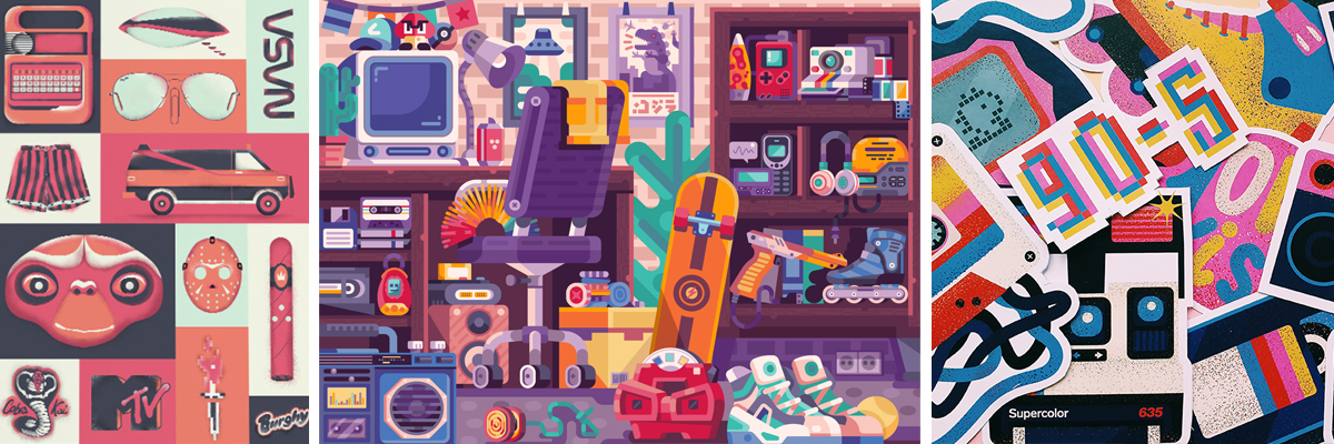 Credits: Alex Krugli, Sail Ho Studio, Maria Fadeeva
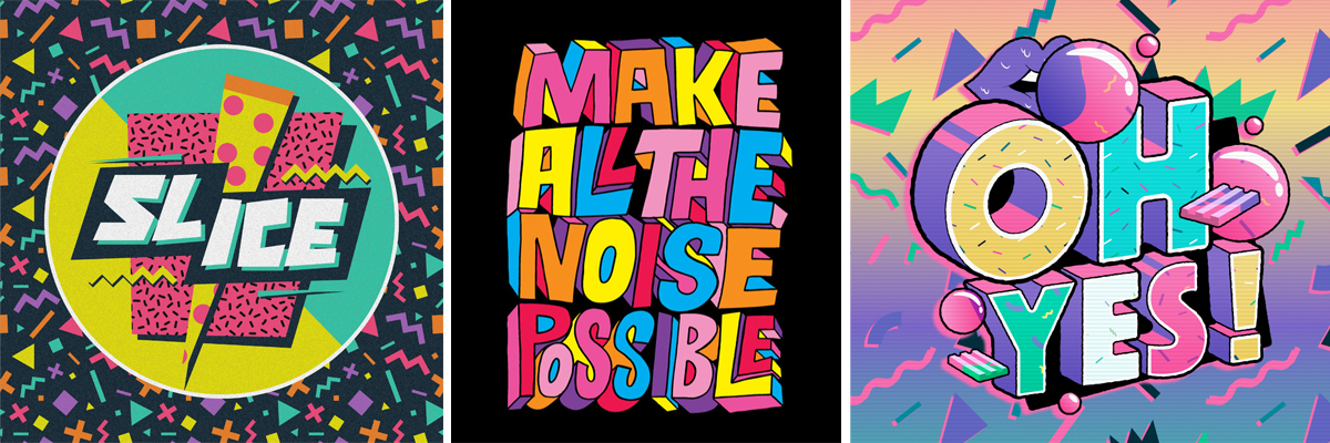 Source: Flickr, Tee's Iscreen Creations
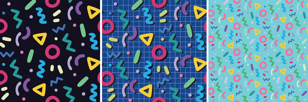 Source: Caty Arte
Rave
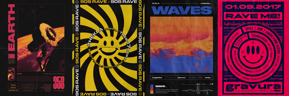
A movement born in the 1980s out of the Acid House scene. Acid House is a subgenre of house music created by DJs in Chicago. The posters created for Rave parties and shows were a bold statement and showed a clear disregard for convention. Many of the poster designs feature smiley faces which was the most iconic symbol for this style.
The 90s impressive collection of rave posters and flyers used for music shows featured a distinct style of neon with heavy use of gradients, bold typography, and a general psychedelic feel. The 80s neon trend is very influential and visible for rave as a design style.
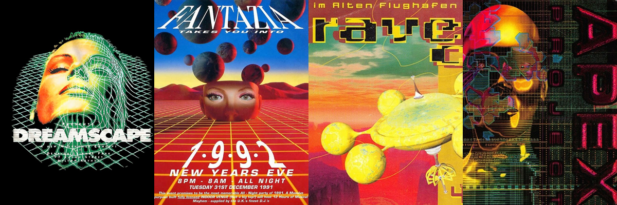 Source: redbubble, mixmag
 Source: gelements, headfirstbristol, Maxim Geychenko
Anti-design
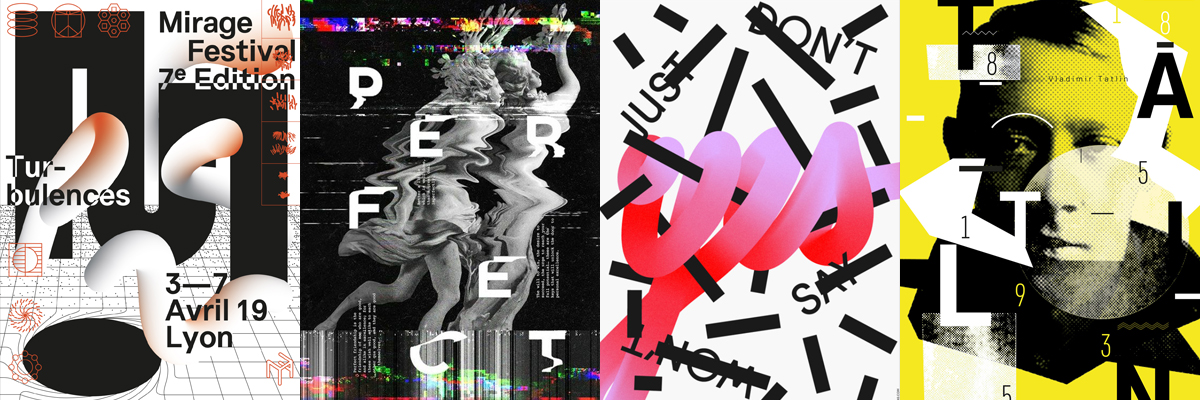
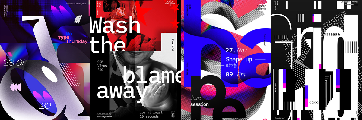
It is an expression of rebellion. It first appeared in the 1960s and made a comeback in the 1990s. It features experimental layouts, exaggerations, distortion, and distorted objects and elements deemed as “ugly” to protest beauty and perfection.
Anti-design is not a metaphor and it is exactly what it suggests. It is a trend that goes against all design rules and aesthetically pleasing content. It is a medium used to express the chaos of the world and to protest and deny its beauty and grace.
 Source: Cecile Roger, Lera Zaitseva, Umut Guney
 Source: Ionut Balan
Grunge
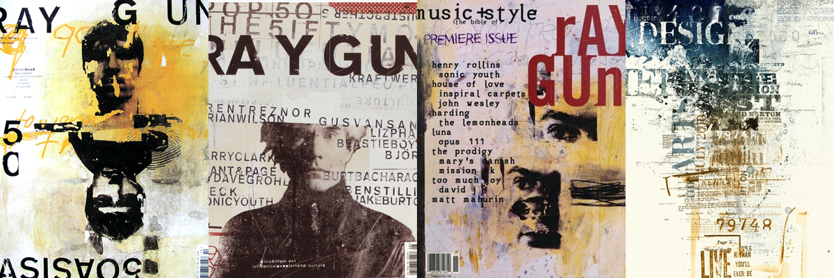
Grunge design is dismissive of grid-based layouts and often includes collage graphics, broken types, and grime textures.
Grunge origins are tied to graffiti art, skateboarding, and punk music. This style appeared in the 80s and it was very representative of what certain music genres were all about and what the style was. It grew alongside the rise of Alternative Rock.
Ray Gun magazine is a spectacular positive example of grunge design. Ray Gun was an American alternative rock-and-roll magazine that was first published in 1992 in Santa Monica, California. Beach Culture magazine is another magazine that is worth mentioning.
 Source: designhistory, visualartsdepartment, designarchives
Movie posters
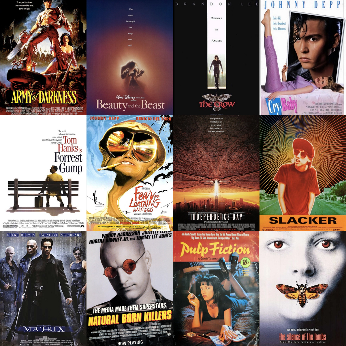 Source: indiewire
Popular 90s Sitcoms Cover Designs
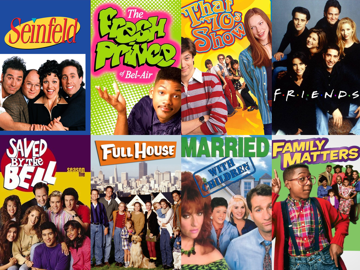 Source: IMDB
Album covers
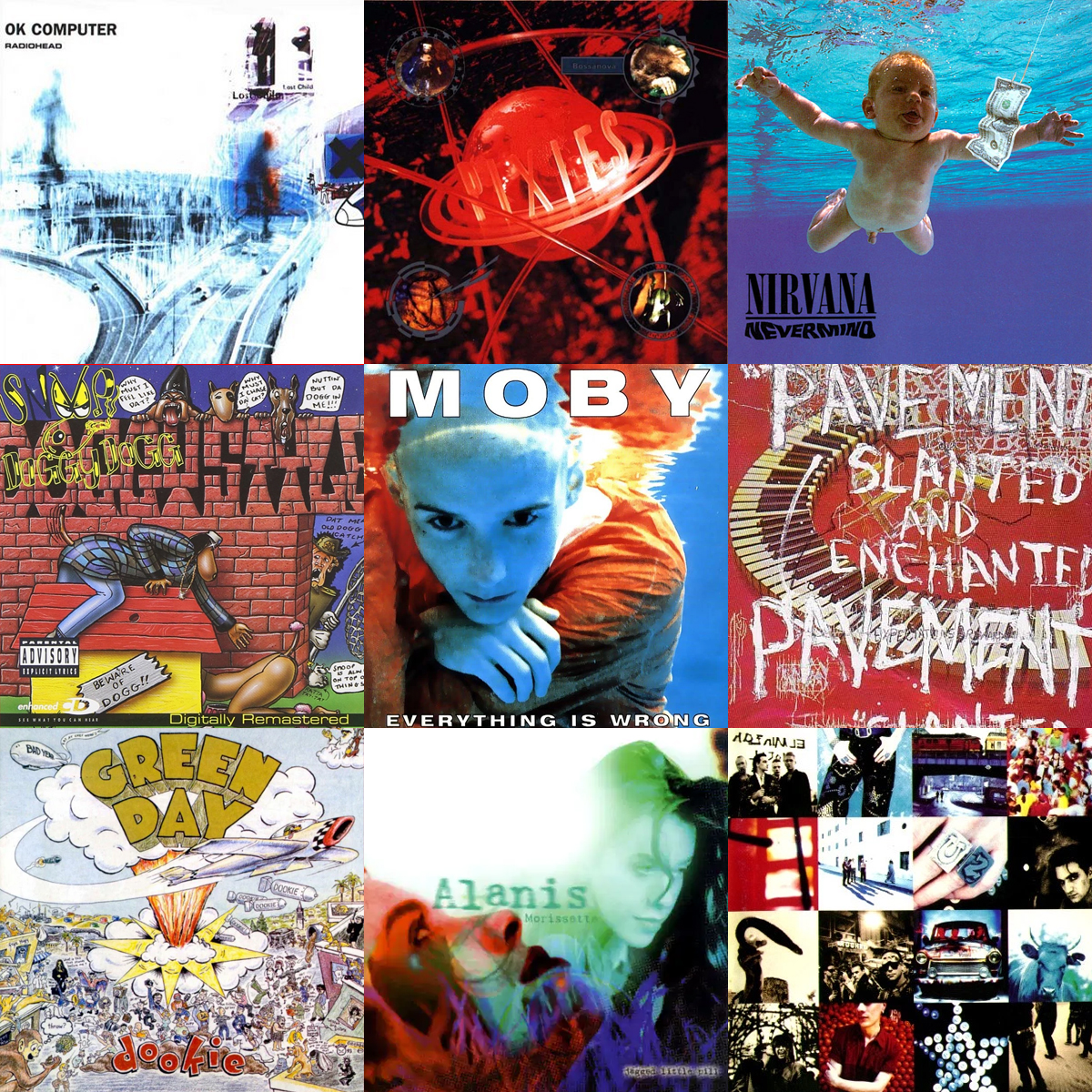 Source: rollingstone


